Crafting Durable & Premium Packaging

Qi Ayurveda brings you haircare formulations that are highly potent and radically transformative. Hibiscus was approached by the brand to solve three recurring pain points:
  • Structural Failures – Flaps opening during transit, cartons tearing or cracking at folds, and moisture damage during handling.Inconsistent re, shock-resistant structure
  • Inconsistent Color Matching – Designs approved on-screen often looked different when printed, especially on sustainable substrates like kraft or recycled boards.
  • Material Limitations – Low GSM paperboards caused staining, oil absorption, and durability issues, particularly for wellness brands like QI Ayurveda, where aesthetics were central to brand identity.

The Challenge: Premium yet Sustainabel

The challenge was clear: create packaging that was reliable, visually consistent, premium in appearance, and sustainable in material choice.

    Our Process: a 360° problem solving lens—addressing structure, color, and material simultaneously.

    01 Engineering Functional Mono Cartons
    02 Solving Color Matching
    03 Smart Material Interventions

    Phase 1: Engineering Function Mono Cartons

    Custom Construction: We designed mono cartons with straight tuck/reverse tuck ends, auto-lock bottoms, and window patches for visibility.
    Moisture Protection: We then introduced water-based coatings and lined variants for sensitive products.
    Operational Ease: We auto-locked the bottoms to reduce assembly time, improving efficiency in high-volume SKUs.

      Phase 2: Solving Color Matching

      Screen vs. Print Reality:
      We helped clients understand the gap between RGB screen mock-ups and CMYK print outputs.with Foam Prototypes
      Digital Printing:
      We use digital printing for short runs and prototypes, balancing speed with moderate colour accuracy.
        Offset Printing:
        We recommend this for larger runs—delivering high precision, Pantone accuracy, and better vibrancy control across coated/uncoated stocks.
        Proofing & Testing
        Finally, we conducted physical proofs to ensure colours aligned across substrates, reducing costly reprints.

        Phase 3: Smart Material Innovations

        As part of the project, we focused on material choices that would not only enhance functionality but also ensure a balance between durability, sustainability, and aesthetics. This required a shift away from conventional approaches and toward smarter, more purposeful interventions.

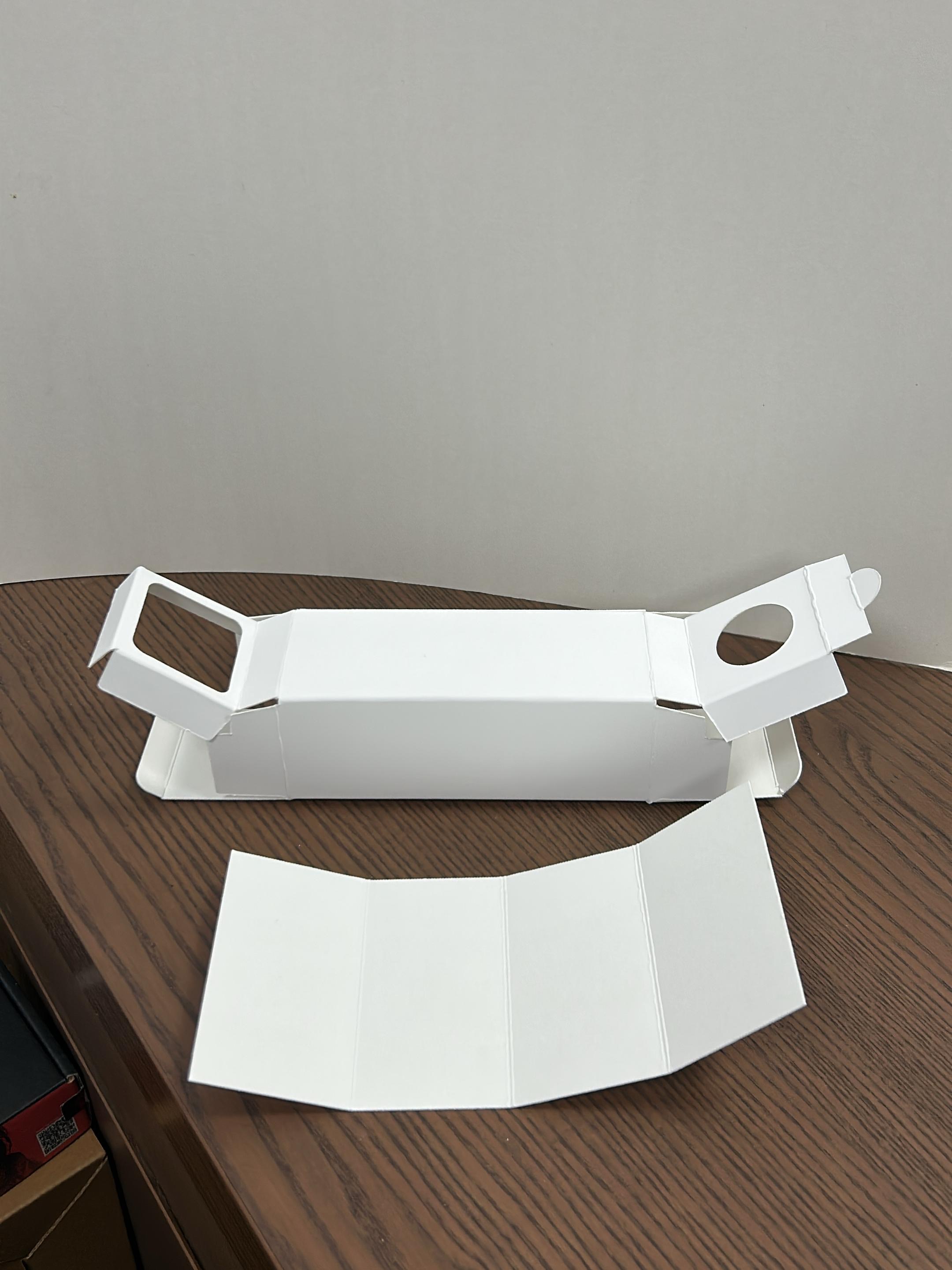
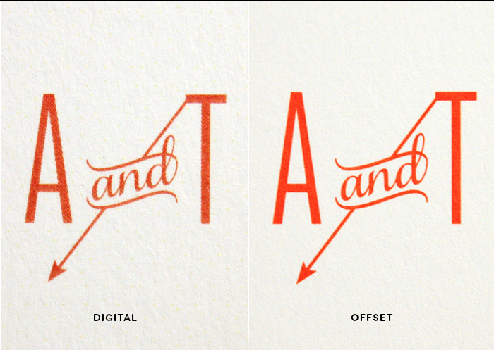
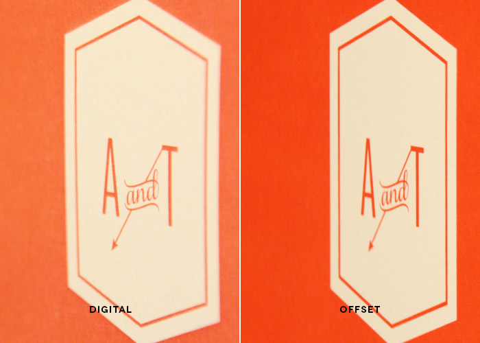
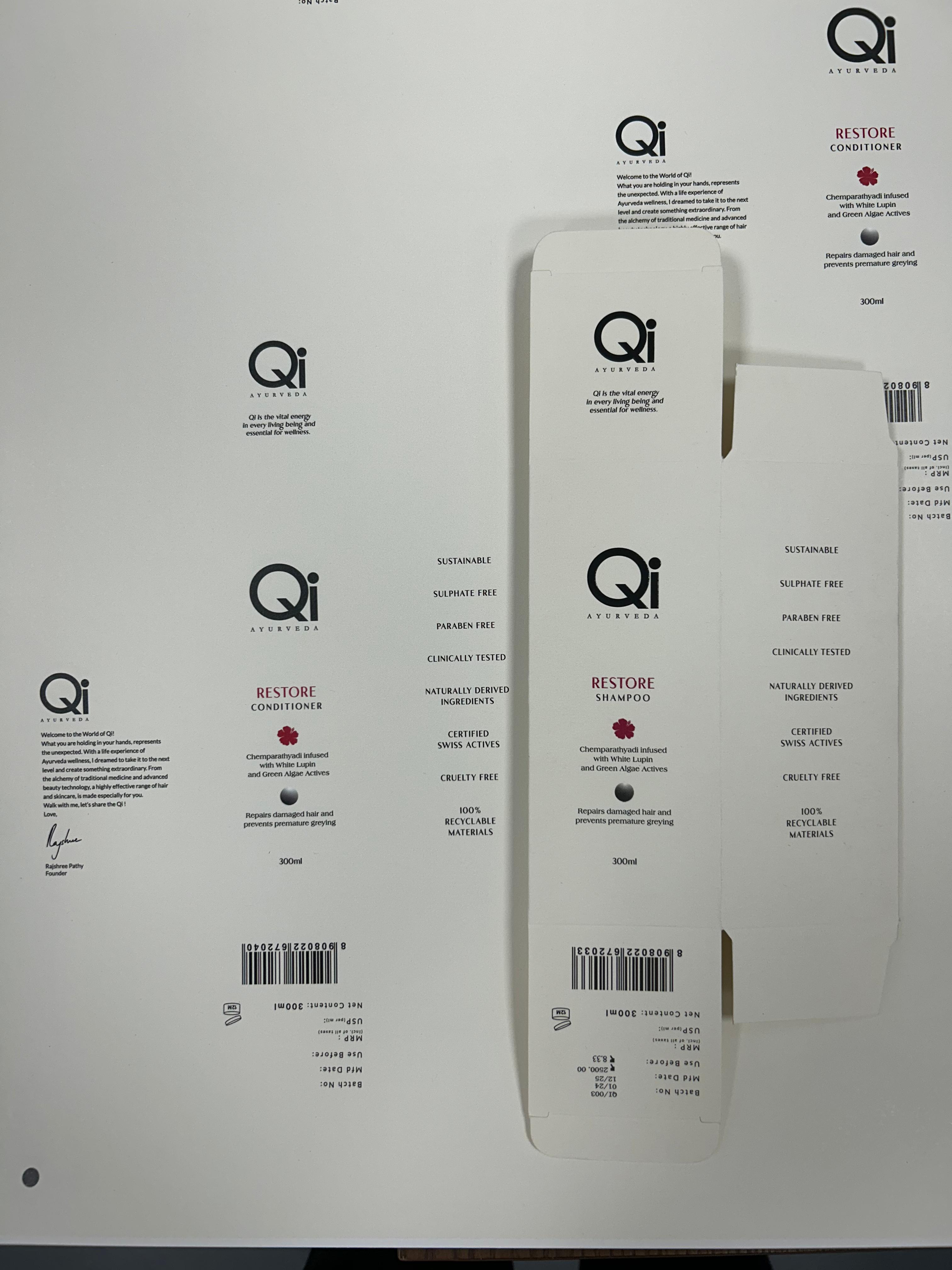
        To strengthen the packaging without unnecessary bulk, we switched from heavier GSM boards to higher burst factor boards. This provided durability and resistance to tearing while preventing the common issue of cracking at folds. For surface protection, we replaced stain-prone uncoated boards with smoother ITC paperboard, which allowed for lamination and delivered cleaner, sharper print results. Additionally, to align with sustainability goals, we introduced oil-based spot coatings as an eco-friendly alternative to plastic lamination. These coatings protected high-touch areas while preserving the natural look and feel of the material.

        The Result

        Naptik’s new luxury packaging system is compact, protective, and refined—perfect for today’s design-conscious, sustainability-driven consumers. By reducing volumetric weight, we lowered shipping costs, improved functionality, and created a memorable, branded experience for every buyer.

        Looking for custom packaging solutions tailored for your eCommerce or tech brand? Let’s build something that’s more than just a box.