Brand info & problem statement

Avynā is a premium women’s wear brand born at the intersection of elegance and empowerment. Our collections blend ethnic aesthetics with contemporary silhouettes. Crafted using high quality, conscious fabrics, aVynā is for women who express themselves boldly, gracefully, and authentically.

They were looking to design a whole packaging range that looks cohesive and attractive. The visuals should match the emotion of the brand while letting their collection be the highlight.

Key Challenges

  • Unclear visual direction: Given the dynamic brand description, what design elements can emote contemporary womenswear. The one thing that the team was keen on maintaining were the colour palette. 
  • Packaging style: Suggesting different unboxing experiences to the client and deciding the appropriate style of the box, dustbags, cards.

Our Process

01 Competitive research
02 Trend research
03 Design process

Phase 1: Competitive research

Research: We began by studying the purpose behind Avyna, their target audience and absorbing the visual language of their apparel collection
  • TrueBrowns: They emphasize sustainability through the use of organic fabrics, upcycled materials, and eco-conscious packaging, aligning with their ethical fashion principles.
  • Rustorange: They have formulated a brand print to increase brand familiarity - used across their packaging.

Phase 2: Trend research

1. Tactile experiences - special effects: Utilizing 3d effects such as embossing, debossing, and special varnishes to engage consumers' sense of touch and make the packaging further luxurious.
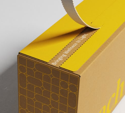
2. Tear to reveal packaging: This involves a perforated strip that calls for the consumers’ interaction of peeling to reveal the product inside.
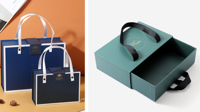
3. Bag style box packaging: Handles added to a packaging box makes it look like a shopping bag - adds to the consumers’ experience. It is easy to carry yet shippable and looks premium. An interesting illusion, 2-in-1.

Phase 3: Design process

1. We started by building moodboards for the master visual direction worked on 3 different styles that resonnate with the brand’s purpose.

2. One of these was inspired by design elements used in their collection circles; the other was inspired by a design trend gradients; while third was a playful illustrative approach. 

3. The client wanted 2 of these and we crafted a glimpse of how it could work out as a master visual direction.

4. Out of the gradient and illustrative, the client picked the direction with playful elements that are also rounded and hence connect with their womenswear designs.
  • Designed a sliding box as the primary packaging Majorelle blue outside, beige inside.
  • Interior elements include playful copy and motivational messages ideal for a premium unboxing experience.
  • Hangtags: Custom logo cut-outs, rounded shapes, elevated layout.
  • Thank you card: Curved visuals that continue the playful yet elegant theme.
  • Tissue paper & tape: Repetitive brand elements used for a consistent, high end feel.
  • Overall, the packaging aligns with luxury brand packaging and sustainable fashion values.